We may have stepped widely into the digital era where information is exchanged online, but physical networking remains irreplaceable when it comes to closing a deal. Designing business cards the right way is important to making the right impression with the clients.
Research shows that 88% of handed out business cards get thrown out in a less than a week time. This usually happens because of a clumsy design. Think of your reaction when you receive a well-designed business card with bold copy in oppose to a dull, non creative one. The one you find interesting, you will keep, because that company now looks promising to you. This is why designing business cards is important.
So, how do you create a business card that falls into that 12% of cards that don’t get thrown out? Follow these 7 tips to designing a great business card customers and clients will be impressed with.
Color and typography
Color combination the first thing the recipient will see when he/she gets your business card. This is the chance to get noticed, so don’t put it waste. There are couple of ways that design experts suggest for the color scheme:
Complementary colors
These are the colors situated as opposites on the color wheel. The pairs are: blue-orange, red-green, yellow-purple. In designing business card, you should use these color combinations for main information and accents, eg. name and title in red, URL in green.
Analogous colors
These are the colors with the same undertone, situated next to each other on the color wheel. This is smart choice as well, particularly when using flat design. These can be used as combinations of two or three tones of one color.
Triads
These combinations are built with picking one color on the wheel and then the forth color thereafter, plus the forth color after that one. This will give you a dynamic set of colors, thus an active look and feel of your card.
Split-complement triads
These triads are constituted from a selected color on the wheel, it’s opposite complement and the color next to that one. This allows more possibilities in accentuating details around the main text of the card. An example of split triad would be: green-red-pink.
When choosing colors for the business cards, you should stay inline with the colors of your brand.

Typography selection is just as important as your color choice. From our own experience we can say that the smartest choice is using one font in different size and accents, such as bold, italic, underline. With flat, contemporary design this seems to work really well and people usually react positively to it. If, however, you wish to use more than one font, we suggest not to use more than three similar fonts, because you want to avoid creating distraction from the important information.
Include the right information
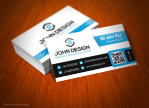
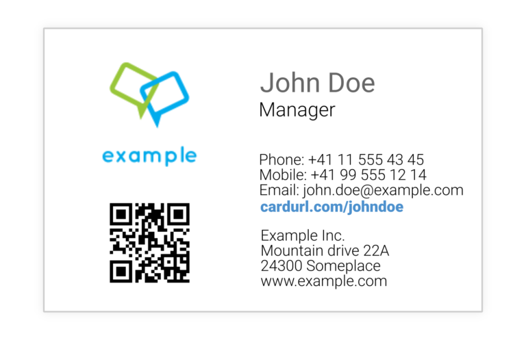
Sounds like a given, but choosing the right information to put on the card can be crucial to your networking. Nowadays, people can reach you in so many ways, opting for one information over the other can be a quite challenging business. Start with your audience. If your target customers are younger people, than you should definitely include at least one social media channel. Put some thinking into where your customers are and how they communicate and select only the most important channels. The information that are a no brainier: Name and Title. These are a must because anonymous cards can decrease your chances for potential clients reaching out to you.
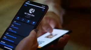
If you wish to communicate your more information about the business with your customers, think about using an app which generates QR code, possible to withhold more data.
Make sure it’s readable
With new design trends we are used to see simple surfaces with delicate color layers and small, noninvasive characters. Design is important, so make it clean and neat, but make sure that all of the text is immediately readable. Create a hierarchy with font size bringing out the most important information straight up front. The same goes for color.
Another risk is to overload business card with too many information or too big letters and overwhelming colors. This will just confuse and frustrate the recipient, and you don’t want that. Most of the design masters would say that simplicity is the key of design. Not for the artistic value, but for the usability of the information on the card.
Be creative
The level of creativity of business cards to a certain extent depends on the industry or type of business you are in. But, mostly it depends on your target customers. Sometimes it can be effective to go wild and create something useful from your business card. Adding a function to a card, such as making it a coaster, matchbox, USB stick, 3D glasses, bottle opener etc. will certainly motivate the customers to keep the business card as something they can use afterwards. Another way of designing business card that will stand out is to make it scannable. Applying a QR code is not only creative and engagement-focused, but it can also help you to put a ton of information about your business on the card without taking too much space. CardURL, for example, generates a ready-for-print vector QR code that keeps the same high-quality look no matter the amount of information you put in your profile.
Use the right material
Just as the rest of the design, you’d want to put a good deal of thought into the material of your visiting card. It contributes to the perception of your business and the level of professionalism. High-quality paper is a more expensive option, but with this small investment you will have a card that doesn’t look cheap and are not so easy to tear. Other unconventional options are recycled paper or textured materials. Both options make the eco-friendly statement as a part of your company’s philosophy. It’s a cheaper way to show that you are environment conscious than investing in an ecological campaign. There are some companies even that have created edible business cards, materials such as chocolate, meat or candy have been very popular in this department in the last few years. The problem with these cards is that they are bound to disappear very quick.
Additional text
Additional text usually consists of a tagline. It’s an invitation to the recipient to look you up. Taglines are best to be printed on the back of the business card. It represents the space to communicate the message of your company. Telling your customers in short what you are all about or why they should contact you is of great importance in the marketing era we live in. Look at it as a paper-based call to action or the trigger that brings out an interest of the customer. You can be really creative here or straight to the point, the choice is yours. Simple „view our website“ can be equally effective as your logo something like „nice to meet you, keep in touch“.
Double-check everything
Even though you can have an editable QR code printed on the card, you ought to go through information carefully before going to the printer’s. We have been to so many conferences, exchanged so many business cards, and from personal experience we can tell you: there is nothing more unprofessional than a card where information is written over with a pen. That is just not cool. Check every letter 10 times if you need to before printing. It’s boring and time consuming, but look at it as an investment in your business. Our strong advise is to have a QR code on the card as well. This way, even if you physically change the address of your office or a phone number, you will not have to write the new information by hand. You can simply tell the recipient of the card to scan the code for updated information.

We hope to have helped you in creating your new business card. If you have any more suggestions on what else should be included in the guideline, please do write in the comment below.